Accessibility audits: getting started
Accessibility audits can be daunting to get started with. Here are my recipes to deliver accessibility audits for web projects, combining multiple layers of automation with manual testing to get the best of both worlds.
Auditing strategy
First, determine what standard to audit for. WCAG 2.1 AA is generally a good start, as the standard that underlines many countries’ regulations. Don’t stop at any given standard though – the goal of an audit really is to identify improvements, rather than compliance box ticking.
With this in mind, start with automated tools to find as many issues as possible. Then, we can dedicate more time to more thorough manual testing of specific pages or components.
As a developer, I like the audit to be based on tools that can be used in automated test suites. Continuous integration capabilities are a big plus too, making it much easier for the site to keep being tested consistently after the auditing work is over.
Accessibility audits for beginners
It’s worth pointing out early – while some parts of my approach are very beginner-friendly – others rely on years of experience with accessibility guidelines and usability best practices. If you don’t know where to start, here are the easiest first steps:
- If you’re familiar with command-line tools and want something quick, grab Pa11y and point it at pages.
- If you want to analyse a page more thoroughly, use Accessibility Insights in Chrome.
- If you have money, get SortSite or Tenon. I haven’t used these myself, those recommendations are only based on the invaluable GDS accessibility tools audit.

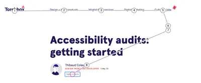
Accessibility Insights’ tab stops tool is invaluable to identify strange tab orders, and optimise keyboard navigation
Intermediate-level auditing
Source code analysis
If possible, this is always a valuable first step. Identifying issues directly in the code will make them much easier to fix, and improves your chances of finding issues that might not be identifiable during manual testing because they rely on a specific state of the app or site.
Linters are very useful here:
- eslint-plugin-react, eslint-plugin-jsx-a11y for React, which has the most advanced static analysis tools of any front-end stack.
- curlylint for HTML templates, my (experimental! 💥) attempt at bridging that gap.
I also audit code manually, by searching the project’s source. Here are common patterns I search for:
- Usage of the "role" attribute. It’s very easy to misuse – roles that don’t exist, that need specific parents or children, that are redundant with the element’s intrinsic role. Roles that have no practical impact without further ARIA attributes (most commonly labels, or state).
- Usage of ARIA attributes. They are also easy to misuse.
- Tables markup. Tables need a caption, and headers that define their scope.
- Button markup. Misusing anchor tags for buttons.
- Forms markup. Making sure they use the correct native controls, with sensible attributes.
- Tabs, menus, dropdowns, toggles. It’s quick to check whether they have any kind of keyboard navigation implemented, and whether they have the correct ARIA attributes set for any given state.
Bulk page checks
After looking at the source, the next step is to look at pages in “bulk” mode – running automated tools that scan as much of the site as possible. My preference is for:
- The V.Nu HTML5 validator. Either the Docker image, or the pre-compiled CLI binaries, `vnu <url>`. Generally I’ll either do this for the whole sitemap, or a subset of URLs.
- pa11y-ci, or Pa11y directly, for the whole sitemap or a subset of URLs if there is a need for further automation. `pa11y-ci --config <my config> --sitemap <project sitemap> --json > sitemap-report.json`.
Pa11y is worth a special mention here. Pa11y is a wrapper of Axe and HTML_CodeSniffer, which do the actual accessibility checks. It allows those tools to be run in bulk mode, over many pages, or at different states of a page by interacting with it automatically.

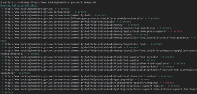
Testing hundreds of a pages in a one-liner – thanks pa11y-ci!
Here is a basic configuration file, summarising how I tend to use it:
🚧 Head over to wagtail-tooling for a more advanced example of using Pa11y on a large-scale project.
Single-page checks
Now let’s look at intermediate techniques to apply per page. Depending on the site’s size, number of different page types, and budget for the audit, I would generally apply those checks on a sample of between five to ten page types. First,
- Pa11y, if not already used in CI mode. Make sure it runs both HTML_CodeSniffer and Axe.
- The Accessibility Insights extension from Microsoft, with its FastPass mode, which also uses Axe under the hood.
Then in the browser, there are a lot of semi-automated tests worth doing:
- With Accessibility Insights – use the colour, heading, landmark tools to quickly visualise the page structure and spot issues.
- With a screen reader’s navigation (e.g. VoiceOver Rotor), inspect all of the page’s landmarks, headings, images, tables, frames, form elements, links and buttons.
Only about 30 to 40% of accessibility issues can be found with fully automated tools, so these semi-automated checks are a great way to go beyond that, without having to spend hours manually navigating pages.

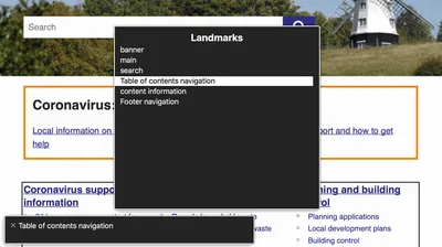
The VoiceOver rotor is a very convenient way to get started with screen reader testing for beginners
Manual testing for high-value pages
Manual tests are the most time-consuming and require the most expertise. We want to navigate the site in the same way a user of assistive technology would, focusing on parts of the experience that automated tests cannot assess. I generally advise to try the following:
Zoom level
- Is the whole page usable with 200% to 400% page-level zoom?
- Does the site support browsers’ font resizing features?
- Are there any issues when using an on-screen magnifier?
- Are there areas of the site that require bidirectional scrolling because of the zoom level?
Colour
- Are there any non-text UI elements for which the contrast is too low?
- Any :focus or other active states that are reliant on colour alone, or too low contrast?
Keyboard navigation
- Can the whole page be used with a keyboard only? Single-handed?
- Are there keyboard traps?
- Are there parts of the page where focus should be trapped but isn’t?
- Are the tab stops logical?
Screen reader navigation
- Can the whole page be navigated with a screen reader?
- Are there relevant things on the page that aren’t being announced?
- Or things that shouldn’t be announced? E.g. decorative images, or repetitive text.
Pointer navigation
- Are pointer targets big enough, and not too close to one another?
- Are there areas of the page that are hard to scroll (especially on mobile)?
- Are there areas on the page that require horizontal scrolling (especially on mobile)?
This barely scratches the surface, especially when it comes to screen reader usage. Test with multiple screen readers if possible – my go-tos being VoiceOver with Safari on macOS & iOS, and NVDA with Firefox on Windows.
Expert-level accessibility compliance testing
All of the above is great in order to make a website accessible, but to assess compliance with standards, you need to know the actual standards, and test for each of the compliance criteria. For WCAG 2.1, I recommend to:
- Know all of the WCAG2.1 A, AA, AAA success criteria – refer to the GOV.UK WCAG 2.1 Primer for a “cheatsheet” version.
- For each commonly-used component, know which success criteria are relevant – refer to the official WCAG2.1 quick reference.
- Know about established ARIA practices, and their respective browser support.
Once you’re ready, dive through Accessibility Insights’ Assessment tool, which is by far the most advanced freely available accessibility compliance testing tool there is.
Beyond audits
Congratulations, you’re now equipped to audit websites! Make the most of those skills to identify improvements on the sites you build and use – but keep in mind that no single audit can deliver ongoing, sustainable accessibility.
Going beyond audits, it’s worth investing into training to create accessible experiences as a default. Also look into opportunities to have accessibility be part of your normal process – whether that’s by having tests in your UI library as a developer, or accessibility features in the CMS as an editor. More on that in a future post!
Thank you to Jane, Paul, Tom, and Steven for their help with this post.
Find out about our Accessibility Testing service
We can identify barriers your users may be coming up against, and suggest updates to improve the usability of the site for all. Find out more or book an accessibility audit.

