
Five ways to improve your charity donation page in 2026
A core challenge for many charities in 2026 is the widening gap between donor intent and final action. People still care deeply about the causes they support, but they have less time, more choice, and growing questions about where their money goes.
This guide explores how small improvements to your charity donation pages can help close that gap. We’ve combined sector data, behavioural insight and real-world examples to highlight practical changes that can improve conversion rates and turn intent into meaningful support.
How to improve the conversion rate of a charity donation page
To create a donation page that converts well in 2026, you must navigate a perfect storm. Public giving is at a record low, with only 50% of UK adults donating to charity in the past year, the lowest level recorded by the Charities Aid Foundation.
When fewer people are giving, the experience donors encounter when they decide to support you matters even more.
A high-performing donation page needs to balance emotive storytelling with a clear, frictionless experience that works seamlessly on mobile. We’ve put together a simple checklist to help you audit and optimise your own page.
1. Clear and compelling headlines
Immediately tell a visitor why their donation matters.
We love examples like: “Bring clean and safe water to every person on the planet”, from charity:water, and “Support us to fight injustice, free the wrongly imprisoned, and expose human rights violations worldwide”, from Amnesty International UK.
2. Impactful visuals and statements
Use high-quality, emotionally resonant images that tell a story. Pair these with specific impact statements so people know exactly what their money achieves.
For example: “£50 could provide emergency food for five families for a week.” Or this example from WWF-US, “Our world is in trouble, and we need to act now”, alongside striking wildlife imagery.
3. Pre-select donation amounts
Offer at least three options with associated impacts. We recommend pre-selecting/highlighting the middle option to gently nudge giving. Studies suggest people often choose the middle option because it feels like a safe, rational choice.
It’s also worth defaulting to monthly giving. Regular giving revenue increased by 8% last year, while one-off cash revenue fell, according to M+R Benchmarks UK & Ireland 2025.
Reducing decision friction at this stage can have a significant impact on conversions, something we regularly see in Conversion Rate Optimisation (CRO) projects.
4. Trust indicators and social proof
Donors need to feel secure. Display your charity registration number and logos of trusted partners or accreditations, such as the Charity Commission or Fundraising Regulator. It’s also important to demonstrate Experience, Expertise, Authoritativeness and Trustworthiness (E-E-A-T).
Social proof can also encourage giving, whether that’s donor testimonials or subtle real-time donation alerts. These signals create reassurance and a sense of collective momentum.
5. Demonstrate how every £1 makes a difference
Address the "where the money goes" concern directly, as 53% of the public say seeing money spent directly on the cause is the most important factor in building trust.
Examples of charity donation pages and why they work so well
There’s no single formula for a high-performing charity donation page, but there are clear patterns in what works well. Here are five organisations putting these principles into practice.
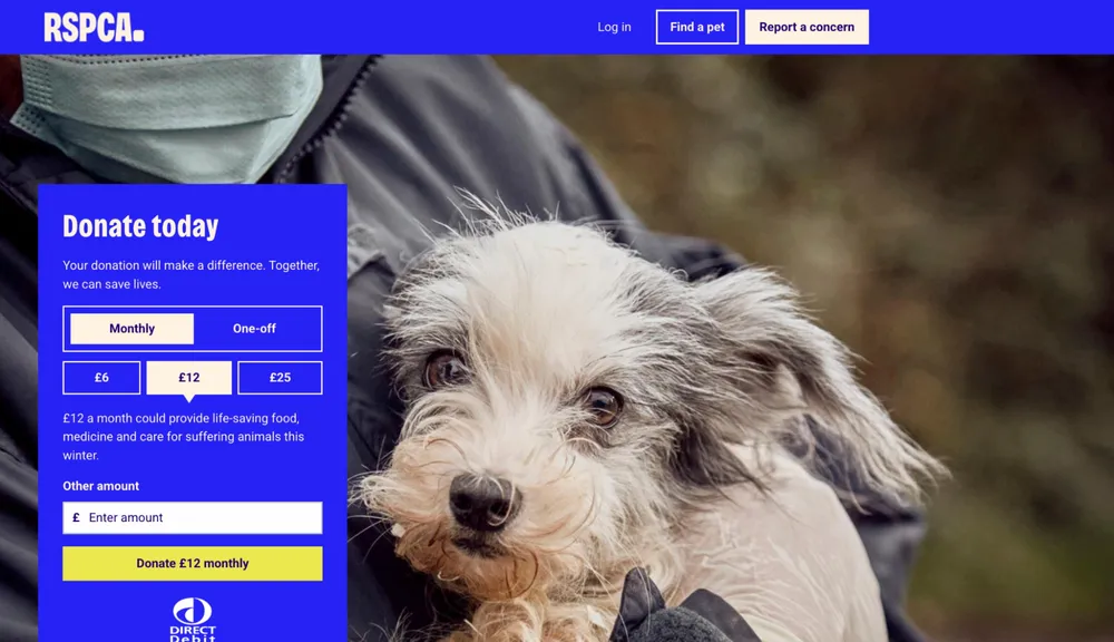
RSPCA
RSPCA puts its form at the very top on mobile with a powerful impact statement, ‘Together, we can save lives’.
The layout is clean and intuitive, while the copy is concise and easy to scan. The suggested monthly donation simplifies the choice, and the impact stats right under the ‘Donate’ button reinforce that you’ve made a decision to support a meaningful cause.
What to take away: Clear structure and visible impact reduce hesitation and help supporters act quickly.
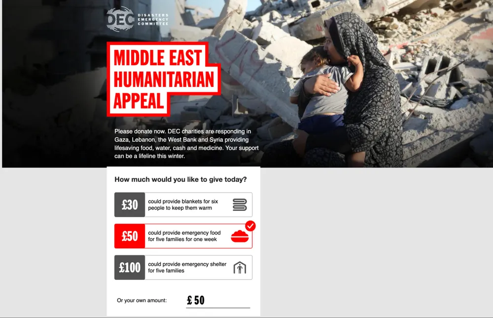
The Disasters Emergency Committee
The DEC Middle East Appeal page is a masterclass in purposeful, accessible design. It uses simple language and creates a sense of urgency that encourages immediate action during a crisis.
This builds trust through clarity. During a crisis, donors want to help fast. The DEC appeal removes all unnecessary navigation and content, focusing purely on the act of giving.
What to take away: In high-intent moments, clarity and focus matter more than volume of information.
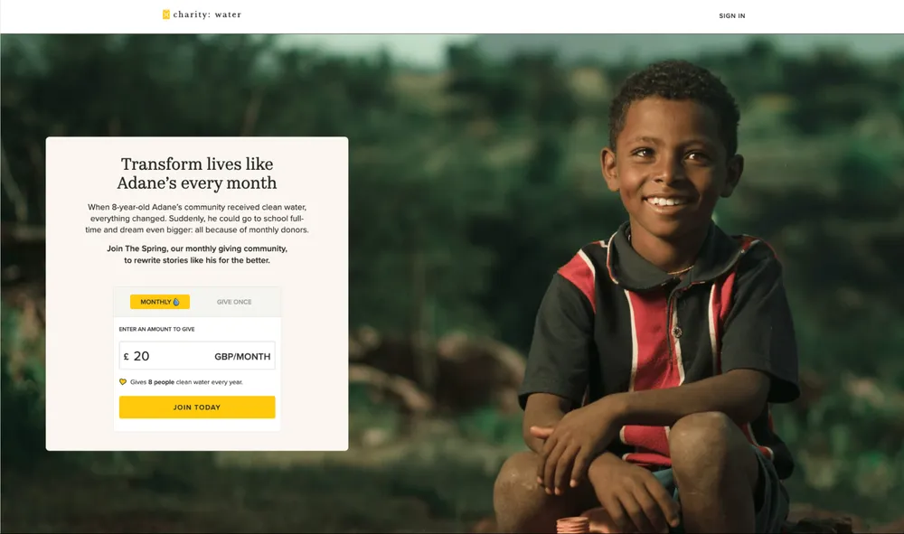
charity:water
charity: water is famous for its ‘100% model’. By removing the “where does my money go?” doubt, they directly address one of the biggest barriers to giving: trust.
Their donation landing page is incredibly accessible and offers varied payment options like Apple Pay, making the checkout process feel almost instant.
What to take away: When trust is explicit, and payment is seamless, supporters can give with confidence.
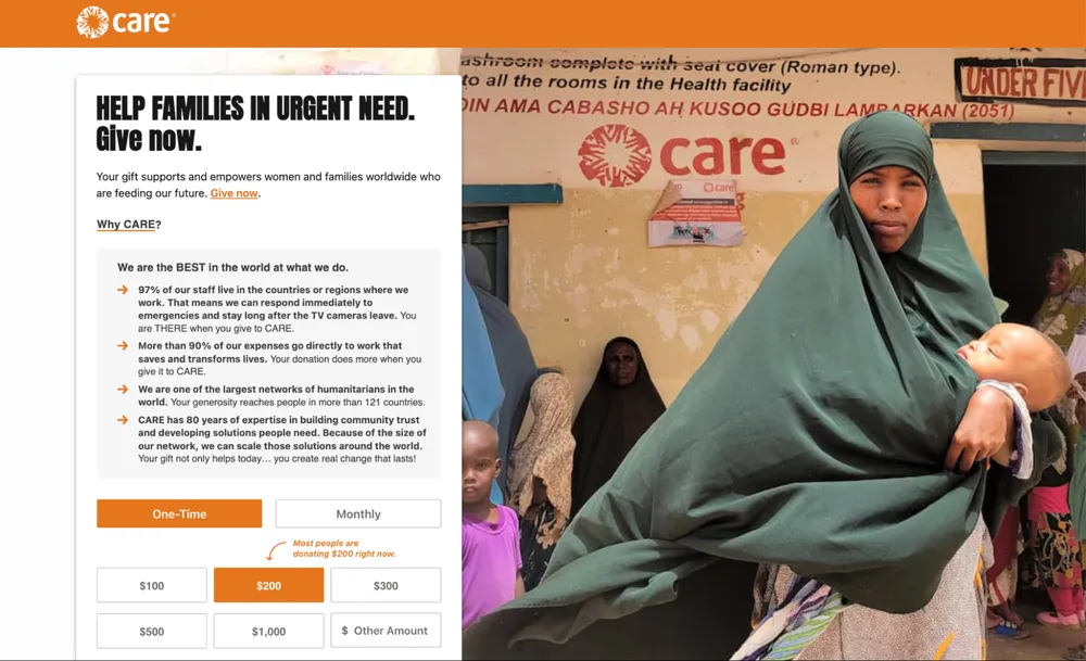
CARE US
CARE US uses clever social proof, stating: “Most people are donating $300 right now”.
This reduces choice paralysis. When donors aren’t sure how much is “enough”, this kind of nudge provides a social benchmark that validates their decision.
It’s okay to guide donors, many want to understand what a typical contribution looks like.
What to take away: Thoughtful behavioural nudges can build confidence and increase conversions.
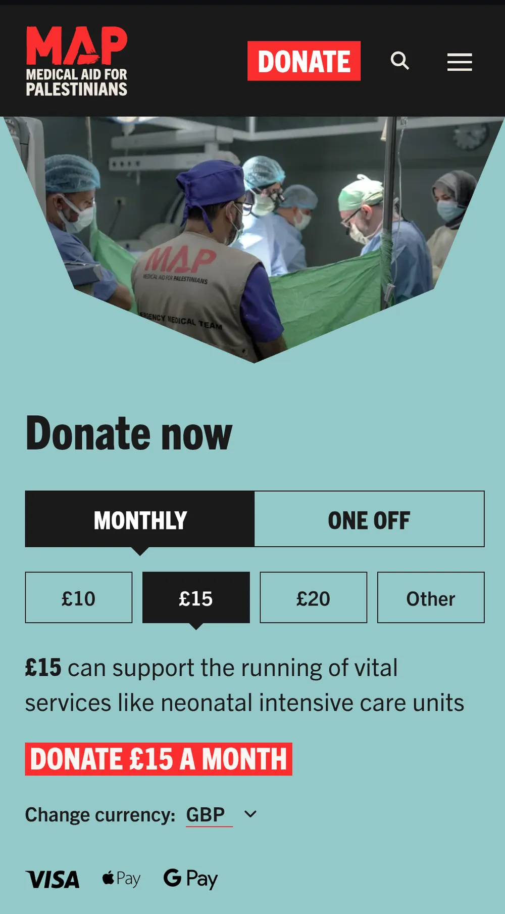
Medical Aid for Palestinians
Medical Aid for Palestinians (MAP) offers a great mobile experience, placing the donation selector towards the top alongside relevant impact statements.
By integrating modern mobile payment methods like Google Pay and Apple Pay, they remove the friction of manual card entry, a common hurdle for donors on the move.
What to take away: Prioritising one-tap payment options is essential, alongside a clear mobile-friendly layout.
We recently launched their new website on Wagtail CMS - read all about it here.
Charity donation page FAQs
Should you include the main website navigation?
We recommend removing it.
A “leaky funnel” happens when a donor clicks away to your ‘About Us’ page and forgets to finish their gift. Keeping the focus on the donation helps protect conversion rates.
Which payment methods should you offer?
Beyond credit cards, you should offer digital wallets like PayPal, Apple Pay and Google Pay.
These are essential for mobile users who don’t want to type in long card numbers or don’t have immediate access to their card details.
I don’t have resource or time to focus on this at the moment. What’s the one thing that can make the biggest difference?
Add impact statements that link donation amounts to real-world outcomes.
It’s one of the most effective ways to rebuild trust and strengthen conversion rates.
We can run an audit of your donation page to help you identify exactly where you might be losing supporters.
More
-

How charities can engage high-value donors in 2026
Marnie Winter-Burke Senior Digital Account Manager
-

Meta restrictions one year on: what charities can do now
Lisa Ballam Head of Marketing, Trustee Director
-

Seasonal giving: how to build a more resilient fundraising programme
Imogen Thomas Client Partner (Charity Sector)
- See more posts