Miro vs Mural: which is the best collaborative whiteboard?
I’ve used Mural and Miro (formerly Real Time Board) for a while and both are amazing web apps. However, now we’re in lockdown Torchbox are stepping up our use of collaborative whiteboards and we need to buy lots more licences, which means committing to one of them.
As part of our evaluation, we’ve built the same board in the two apps, used both to facilitate a workshop and tried out both in webinars with a large number of co-collaborators (70-100).
Here’s what we found and the one that came out on top.
The basics
On both Miro and MURAL, you write on digital sticky notes. You can group them, vote for the best ones, and do all this while a timer counts down. Both of these tools are excellent at facilitating group exercises:
- Mural makes it a bit easier to reorganise a group's sticky notes into a nicely sorted grid. You can do this on Miro, but you have to add them to a frame first.
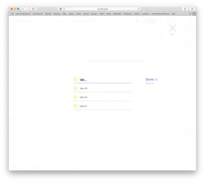
- Miro has a really nice feature to allow users to 'bulk-add' sticky notes. I use this all the time.
- Mural also has a ‘frameworks’ feature, which allows you to add template backgrounds for workshop exercises including grids, quadrants and bullseye diagrams and even 'retro' templates or 'Business Model Canvas' templates. Miro has the same feature and roughly the same templates, but the implementation feels that bit slicker. Where the Mural templates feel like they are 'user submitted', the Miro ones have a little extra polish.
- Miro has cards as well as sticky notes which are a bit more flexible and lend themselves to agile workshops and some user journey mapping.
Verdict: Draw

Bulk adding sticky notes in Miro
Layout Tools
Both have unlimited canvas space that you can build into slides and spaces for collaborative exercises, but which has the better tools for putting these boards together.
- Miro has clearer guides and grids
- Miro has a better range of typefaces
- Mural text management is somewhat unintuitive (‘shift + enter’ for a line break)
- Miro has a few more text formatting options e.g. Mural doesn’t do bullets (pretty fundamental when creating a presentation)
- When resizing an area in Miro you can drag any corner, in Mural it has to be bottom right, so you generally have to reposition the element afterwards - Miro’s implementation is a lot better.
- Mural ‘areas’ seem to act as one layer, so you can’t put elements across them except above or behind the whole layer - this might be an edge case, but it annoyed me when I was creating our board design.
Verdict: Miro wins. This one feels pretty clear. Miro's tools feel that bit more like a proper layout app.
Presenting
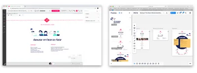
As well as being a collaboration tool, both apps have the ability to present like Powerpoint or Keynote. In Miro you create frames and in Mural Outlines (Option + click on the object you want to be a slide and select 'Add to Outline' [Mural] or 'Create Frame' [Miro]) then, when you are in Presentation mode, you can use your left and right keyboard arrows to move between the slides. Miro has nicer animations that zoom in and out depending on the size of your frames.

The two apps with their 'slides' drawers open
- Miro has a Screenshare mode to ensure that everyone is looking at the right place on the board - the participants do need to actively click the ‘Join’ alert to opt in.
- Mural has a cool feature called ‘Summon’ where the faciltator can force all the participants to the same view that she is looking at. This is a pretty killer feature and one that Miro is lacking.
Typically, we use Zoom for conferencing and screensharing alongside Miro or Mural. However, some users find it confusing switching backwards and forwards between the facilitators Zoom screen share and the whiteboard in their browser (especially when the screen share is of the same app!), so the 'Screenshare' and 'Summon' features are important.
- Miro also has a video chat feature, which is useful if two people are working on a board collaboratively. However in a workshop situation we still use Zoom. I’ve read that Miro’s video chat can’t handle many simultaneous participants.
Verdict: Mural wins by a whisker for it’s 'Summon’ feature.
Embedding links & media
Both tools have the ability to understand a pasted link and make it into a card or widget. Mural makes everything into a card, so if you paste a YouTube video it adds it as a card, which you can then click on to launch as a video. Similarly, Miro creates cards from links but is able to identify some links as media and embed them directly. This includes Google Maps, YouTube, Soundcloud, Google Calendar and more.
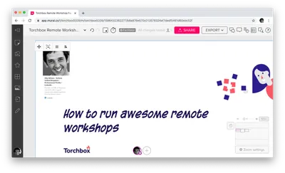
One of the most useful implementations of this is to get collaborators to paste in their public LinkedIn profile address so you can see who you are in a workshop with. Annoyingly this particular embed doesn’t seem to work in Miro, #fail.

The LinkedIn card is added simply by pasting the URL on to the board.
Verdict: Draw. Miro’s implementation is more sophisticated but it doesn’t seem to work for LinkedIn!
Extensibility
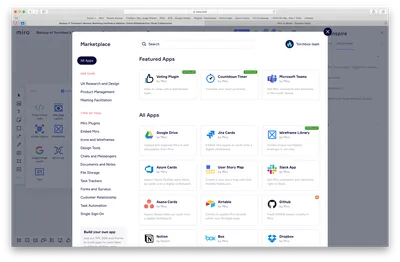
Miro has a bunch of integrations, they call these apps.

Miro's integrations
Many of the integrations involve either being able to embed and use Miro boards in them (Trello, Airtable and Notion) or seeing the outputs of these apps in Miro (like UXPin or Invision), and you can integrate with Dropbox to pull files into your board. Others allow you to pull in granular content to organise visually, like GitHub issues, Jira Cards or the outputs of Google Form responses (these often require Zapier in the middle). Mural doesn’t have these app integrations.
Some basic things in Miro come in the form of apps, like the Countdown Timer and Voting Plugin, these are part of the core offering in Mural. And the Mural implementations do seem to be slightly better, for example Mural’s Timer is a facilitator only tool, whereas in Miro anyone can fiddle with it and potentially reset it. Most often, you wouldn’t expect people in a workshop to mess around with the timer, but still...
Verdict: Miro wins (with the caveat about Mural having better timer and voting).
Interface
- Miro has a very nice, crisp, fresh interface. The icons are sharp, the type handling is good, the layout is intuitive, and the animations are subtle and smooth.
- Mural's interface is a a bit of an acquired taste. It’s quirky and has a retro feel to it. It’s sometimes clumsy, for example hiding the text tool under the icon for 'Sticky notes'?!
- Miro has a second toolbar at the bottom left that is ostensibly (but not exclusively) for facilitators, whereas Mural positions the facilitator tools at the top of the page by the page title and page controls - more intuitive.
- Mural’s icons and text have very poor contrast levels, grey on grey. I haven’t assessed the accessibility of these apps, but it's fair to say that Mural falls at the first hurdle.
- Mural’s board 'navigator' (for quickly moving around the board) seems to work a bit better than Miro’s. In Miro it’s too easy to zoom out so far that you can't see your frames in the navigator.
- Miro’s menus and icons are clearer.
- Both have a good array of keyboard shortcuts
- Miro wins in the Help department. Both have separate help sites but Miro has more help in the app including quite a few mini-videos showing you how to do things.
Verdict: Miro wins
Facilitating
- Anonymous editing is still in Beta in Miro and it doesn't quite lock things down in the way you'd like. For example, it allows anonymous users to unlock elements that are locked and change them. In Mural, you can use ‘Super Lock’ to identify elements that can only be unlocked by users with Facilitator Superpowers. It’s a nice feature.
- When working with big groups, Mural’s ‘Summon’ feature really comes into it’s own.
- Mural also has a 'follow' feature where you can request that participants follow your screen rather than the more dictatorial 'summon'
- Both let the user hide other users' cursors (they can be distracting and obscure areas of the board if a lot of people are doing the same thing), although it would be useful if the facilitator could do this for everyone.
- Both have a handy a view where the facilitator can click on another person's avatar and see what they are doing, much as you could in a workshop.
Verdict: Mural wins
Stability
- These are both impressive web apps, and very richly featured. As a result, both may be too much for older and underpowered machines. However, while we haven't assessed this in detail, stability doesn’t seem to be too much of a problem for most users. Although some users did experience issues when we had 76 people collaborating in a Miro board. For further details see Miro and Mural's guidance.
- Mural doesn’t play well in Safari, for example the ‘option+click’ context menu doesn’t work properly. No such problems in Firefox or Chrome.
Verdict: Draw
Cost
Both of these apps have free packages, but both get expensive if you go on to use them frequently and especially if you buy licences for lots of users. If you want to keep the costs down, you can get your users to participate anonymously. This is sub-optimal in workshops because the facilitator wants to know who is doing what. In Mural, you get around this by paying for the more expensive licences - $20 per month for your team - and you can have registered guests (from another domain) participate for free. In Miro, the cost is slightly lower ($16 per month) and you pay $3 for day passes (these can be for your team or your guests).
Verdict: Draw
The winner...
There's not much to choose between these apps, but we are choosing, and we have chosen Miro. It's a slicker, smarter app, critically it has a better interface both for users and board designers, it has lots of integrations, and hopefully, one day soon, it'll have Mural's 'Summon' feature.
Final verdict: Miro wins!
Update, 18 May 2020: After writing this, Miro invited me to be a Beta tester for their equivalent to the summon feature which I have been trying out. It allows you to bring all participants into a 'follow me' mode as well as allowing you to be able to see what each individual is looking at by clicking on their icon.


