
Design-Powered Digital Marketing
Arms outstretched. Elated (but quite tired) face. Maybe a wave to the camera. Charity logo t-shirt. Finish line. “Sign up today for your place in this year’s [INSERT EVENT NAME HERE]!”
We’ve all seen these ads before; they’re the sort of default images used by any nonprofit looking to promote the places they have for their Challenge and Fundraising Events. These images are fine. They do the job, and they’re understood by users. But as social feeds become more saturated, and our subconscious willingness to even see ads in timelines fades, their days are numbered.
In much the same way as the sector has turned away from sad children and shame to elicit donations, the more digitally mature charities now understand that it doesn’t matter how well targeted your ads are: if the creatives, imagery and calls to action (CTAs) don’t resonate and reflect a campaign’s core objectives, audiences won’t respond. They likely won’t even see the outstretched arms and finish lines amidst, well, all the other outstretched arms and finish lines. Being the same is not enough in such a monumentally overcrowded social media timeline.
Our digital marketing design team has been working with some of our key clients to create assets that look and feel different, better reflecting our clients’ branding and core campaign messaging. In doing so, we’ve put a rocket under our paid social media campaigns, better aligned our charities’ creatives with campaign objectives, and set a new world record along the way.
Here are four recent examples of our work, with accompanying thoughts from our designers Jeth Ordeniza and Ben Tuckwell.
MNDA
Motor Neurone Disease Association is a UK charity focused on improving access to care, research and campaigning for people affected by motor neurone disease.
Brief: Produce a series of static and animated ads promoting MNDA’s Cure Finder campaign, for use across all major social media channels. The campaign’s aim was to drive donations to fund life-saving research into finding a cure for motor neurone disease.

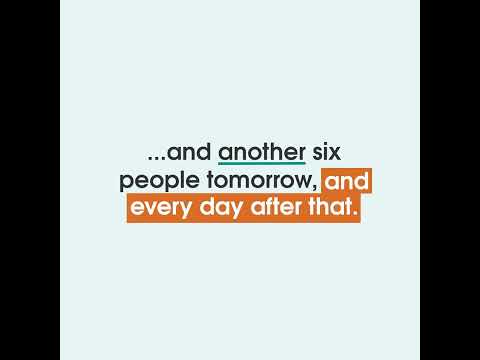
I wanted to deliver ads with a fresh perspective while still having them feel in line with the brand’s personality. MNDA has some incredibly important things to say, and I wanted to help them spread their message as effectively as possible. I used colour, size, iconography, (and movement in the animated ads) to emphasise aspects of their key messages.
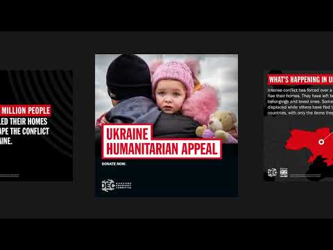
Disasters Emergency Committee (DEC)
Our relationship with the DEC is no secret: we’ve provided digital marketing support to the charity since 2016, and the success of the marketing campaigns we run for the charity is in no small part down to the designs of the ads we create. The DEC ran two appeals in 2021, and we designed creative for both. Our most recent work on the Ukraine Emergency Appeal played a part in setting a Guinness World Record for most money raised online in a single week.
The brief: create a range of static ads for the Ukraine Humanitarian Appeal that focus on highlighting key messages, facts and figures in a striking and engaging way. The creatives should be easily adaptable and used in different combinations and ad formats, e.g. storytelling using carousel ads.

Strong colour contrast was essential for these templates since they were designed to display a lot of text and information in a small amount of space. Including visual components like maps and icons also served to draw the audience’s attention.
Great Ormond Street Hospital Charity
GOSH Charity needs no introduction. Funds raised by the charity go towards life-saving research and equipment to help the 600 children and young people who arrive through the hospital doors daily for life-changing treatments.
The brief: Create a series of graphics for use on Facebook and Instagram promoting GOSH’s Great Big Lottery product, which exists to build income from “committed giving” supporters.

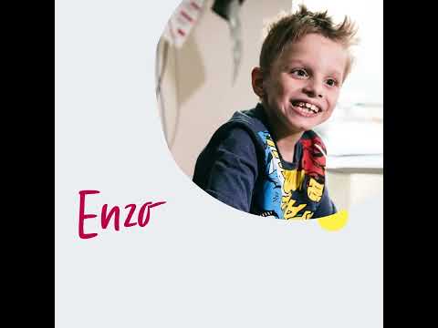
GOSH had some great brand assets to work with which allowed us to create these lively and fun lottery graphics. The handwritten typeface was used to compliment the child focussed imagery, and keeps the creative feeling personal and emotive.
Chatham House
Chatham House is the leading global research and policy institute for international affairs around the world. They’ve been a Torchbox client for eight uninterrupted years.
The brief: Create static image assets for use across Instagram, Twitter and Facebook in support of Chatham House’s CoLab project; an interactive multimedia content hub designed to share ideas in experimental, collaborative ways to support the design of a better future in which society overcomes challenges like pandemics, climate change and conflict.

The use of a graffiti-style font and simple modifications to the angles of the images and backgrounds brought the ads to life, mirroring the intensity and energy of the photographs.
See more of our campaign designs in the show reel below
Get in touch
Our design service can transform your social media and display campaigns, get in touch to discuss how we can help, [email protected]
More
-

London Museum's radical digital transformation
Trish Thomas Head of Digital Innovation at London Museum
- See more posts

