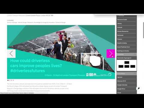
An extrovert intranet for the Royal College of Art
A doctor’s waiting room. Luton. Justin Bieber on endless repeat. John Major’s wardrobe. The corporate intranet. Conventionally, society does not hold these things in high esteem. For many of us, they epitomise the doleful tedium of modern human existence. But in the case of the intranet, at least, maybe there is hope.
From Cape Canaveral to Kensington Gore
In the course of our ongoing relationship with the Royal College of Art (RCA), we hadn’t previously had much to do with the college intranet, ‘RCA Space’. Although rather glamorously based upon the same platform used by NASA (the somewhat extrasensory-sounding ‘MindTouch’), RCA Space was starting to show its age, and the College asked if we could design and implement a new solution for them, tightly integrated with their public facing website. They wanted a fresh start, but were keen for the new solution to offer the same great user experience and ease of use as their Wagtail-based website.

Royal College of Art's homepage
Know thy intranet
Traditionally, intranet implementations are managed differently to public facing website projects. The ratio of content creators to content consumers is normally much higher, for one thing. And an optimal solution for users who need access to information from across a large organisation is likely to involve data drawn from a number of different systems (most notably a staff directory and events, but conceivably any number of systems from finance to room bookings).
But one of the most powerful features of intranets - the very freedom and flexibility they afford users - can be their Achilles’ heel if not managed effectively. A sprawling platform full of poorly organised, out-of-date and inconsistent content quickly becomes unmanageable, actively impeding users from getting things done and forcing them to adopt ‘coping strategies’ for unearthing the information they need most regularly. This was the fate that had befallen the RCA’s existing intranet.
A golden rule of information architecture for external websites is to stay focussed on user needs, and not fall into the trap of using navigation to reflect an organisation’s internal structure. If anything, this rule is even more important in the context of an intranet - even though an organisational focus might actually feel more justifiable.
Content in RCA Space was squirreled away within a deep hierarchy that reflected the inner workings of the College very effectively but did little to facilitate users who needed to find specific pieces of information quickly. When a large proportion of your user base is itinerant (for instance, taught postgraduate students who might only be around for a year) this is a key consideration.
What we did
We proposed to abandon the hierarchical approach and instead created a series of fixed taxonomies to define key concepts like Schools and Programmes, together with freeform categories which site contributors could define themselves. This allowed for a degree of structure, but also ensured multiple routes to content across the site. Crucially though, this light touch approach avoids bogging users down with the cognitive load of trying to figure out where to store or find content in an endlessly complex filing system.
User experience and visual design are key considerations for any project we undertake for the Royal College of Art (which is perhaps not entirely surprising) and they had high expectations for the look and feel of their new intranet. All too often, intranets end up the poor relation of public facing websites - text heavy, drab, and at the stylistic mercy of the IT crowd. But whoever said that intranets couldn’t have personality?
Accordingly, the newly rechristened InfoRCA adapts the design of the external website to create a rich, visual user experience which is consistent for staff and students who move from one site to the other. The design is clean and clear, and actively uses the new flat information architecture to steer people towards the content they need, with a powerful search capability front and centre.
The science bit
Under the bonnet, InfoRCA is based on some exciting new capabilities in Wagtail which we engineered specifically for this project.
- Wagtail was fundamentally designed around the concept of a page tree, so building a taxonomy system flexible enough to support this approach required quite a bit of work. But this is now available for all Wagtail users to benefit from (as of version 1.9). If you’re a code monkey and you’re interested to see how we built InfoRCA, why not take a look at the public code repository.
- The Intranet was created as a separate website, but it shares a lot of content with the main college site using Wagtail’s API. Editors of the public facing site can choose to publish content like news and events on the public site or the intranet (or both).
We’ve tried hard to create a really positive experience for the RCA community, following the sage advice of the legendary Carol Decker: ‘give a little bit of heart and soul’. Intranets have a really important role to play in the effective running of most organisations, and as such they, and their users, are just as deserving of thoughtful, clever design as any public facing website.


