A fresh look for the NIH Office of Intramural Training & Education (OITE)
We transformed the OITE website with a modern, accessible interface that builds upon their minimal legacy brand and seamlessly integrates the U.S. Web Design System (USWDS).

NIH Office of Intramural Training & Education (OITE)
The client
NIH and OITE
The National Institutes of Health (NIH) is a biomedical research organisation based in the US. The organisation is made up of 27 Institutes and Centers, each focusing on biomedical research in a particular type of healthcare (e.g. mental health, cancer, etc.), so that they can improve health outcomes in the US and beyond.
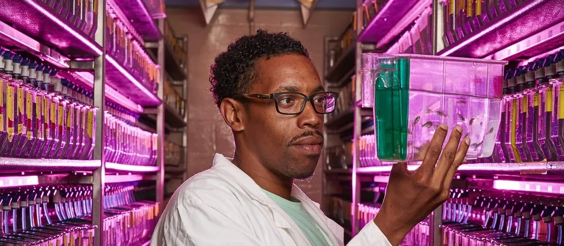
The Office for Intramural Training and Education (OITE) takes care of the recruitment of trainees to the NIH's 27 divisions (everyone from high school internships to PhD rotations), as well as looking after their welfare through curated 'wellness' content, which is available to biomedical scientists both within NIH and globally.
The brief
Building on a legacy brand
OITE didn’t have formal brand guidelines and directed us to the existing site design to get an understanding of what brand identity assets they had developed over the years.
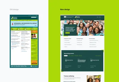
Before (left) and after (right)
They wanted to keep a distinct identity from other areas of NIH by retaining their logo and signature green colour.
Our approach
Developing a new look
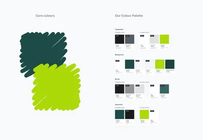
Colour and contrast
Before jumping into component and template design, we built a solid foundation of colours for typography, borders, backgrounds and interactive elements.
We wanted to use colour to create a strong contrast between sections on the page. This helps break up the pages into clearly identifiable sections, which makes it easier to scan for our audience, and it also makes for a more engaging design.
Typography
We selected an attractive, professional feeling and web-optimised typeface that was available in various font weights. This provides a high level of legibility and readability for OITE’s diverse audience which helps build trust in the service.
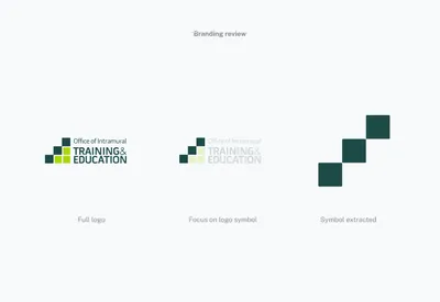
A new design motif
With no existing design styles to work with, we looked to the logo for inspiration. OITE’s logo features 3 staggered ascending blocks, which are reminiscent of a staircase and evoke feelings of career progression and development, which is core to OITE’s offering.
We wanted to use this three block motif across the new design creatively but also functionally. We explored ways in which the blocks could be abstracted creatively and how content could be housed within them.
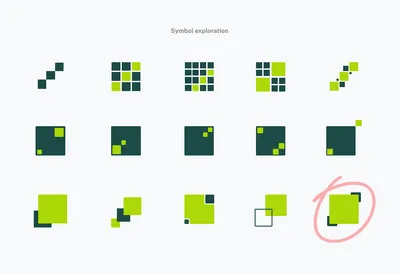
Ideation
We found it worked well to enlarge the middle block and make it the focal point as the first and last blocks framed the content at the edges of the composition.
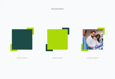
Scaling the motif across the design
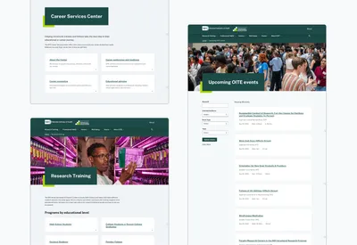
The motif was used across most page templates to draw attention to page titles, key calls to action and content sections within screens.
We aimed to keep the blocks square for maximum call back to the logo mark but in some cases flexibility in the approach was necessary and we used rectangular blocks to house text and image content.
This motif could be used in various colour ways using either of the brand greens as the dominant colour, which added variety and contrast to the design.
Incorporating imagery
Imagery could also be used as the focal point of the motif or used alongside the motif. This allowed OITE to communicate their key messages of inclusivity and support in a visual and authentic way.
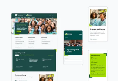
Responsive design
The users of the site are varied and use various device types. The design motif and wider design is fully responsive, working well across mobile, tablet and desktop.
Sustainability benefits
This motif adds visual interest to the site and provides a valuable alternative to using photography which can affect load times on a site. Having to find imagery can also be an extra effort for admins of the site so we were able to relieve some of that burden.
Knowing when not to use the motif
It was important not to overuse this motif as that could dilute its effect and potentially impact the usability of the site .
For any areas of the site not using the motif we used components from the US Web Design System. The USWDS provides a set of best practice components and patterns that have been tested and iterated on.
We adapted and themed these core components in subtle ways so they felt consistent and on-brand but still retained the best practice design approach meaning we still provided a high level of accessibility and usability.
Going beyond digital
With a background in print design, I often have in the back of my mind how digital designs could work in a print context. The motif in the new site design could easily be applied to print or exhibition design.
Read more about building an accessible website with the US Design System and Wagtail CMS.
Need help with brand identity or web accessibility?

More
-

Unifying staff engagement and collaboration across four children's hospitals
Children's Health Ireland
-

London Museum's radical digital transformation
London Museum
-

Building a learning assessment platform
Wharton School at the University of Pennsylvania
- See more work