
Reducing friction for busy hospital workers through human-centred design
When redesigning the intranet for Children’s Health Ireland (CHI) we were driven by the need to create a seamless and connected experience for hospital staff.
Last year, we redesigned the public-facing site by merging CHI’s five existing hospital websites into one cohesive site. The aim was to create a better and more consistent experience for their visitors and to show CHI as a newly unified organisation. Like the websites, each hospital also had its own intranet. To improve communication and ensure staff felt like they were now part of one community, we were asked to consolidate the four intranets into one. Just as we had done with the websites.
One of the biggest challenges was our restricted access to the existing intranets, which limited our ability to fully explore them. This meant it was harder to anticipate the user's behaviour or understand what type of content a regular intranet visitor would typically expect to find. User interviews, like top task surveys, were conducted to provide us with a solid understanding of what needs should be met and ensure navigation and content accessibility were prioritised.
Working towards a Minimum Viable Product
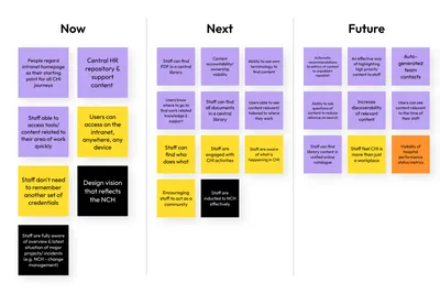
We asked hospital staff what they would find most useful in an intranet and created an outcomes roadmap. This roadmap became our true north, guiding our decisions and helping us pinpoint the most valuable features to include in the Minimum Viable Product (MVP). By doing so, we ensured that the essential elements were in place from the very start, effectively reflecting the vision for the new hospital. Additionally, this approach provided us with a clear plan for future enhancements, allowing us to build upon the MVP in a structured and purposeful way.
To make sure we were consistent in keeping these goals, we had daily catch-ups with stakeholders to discuss our ideas and proposed solutions. This collaborative effort reinforced the importance of human-centred design, prioritising hospital staff’s needs above all else.
Optimising the information architecture
Miles, who handled the research and information architecture (IA) on this project, conducted tree testing and unmoderated testing with hospital staff to better understand how they navigated the existing intranets. These insights allowed us to refine our proposed IA to better meet staff needs.
Introducing new homepage components
We recognised that each person using the intranet had their own work routine and set of responsibilities. To accommodate this, we’ve suggested adding a “My Shortcuts” sidebar component to the homepage for quick access to personalised links within the intranet and helpful resources, saving them an extra step of having to click through the navigation each time they need to reach their most visited pages. This personalisation aimed to make it more efficient for all staff, but especially for those using shared computers (bookmarking websites aren’t encouraged).

Efficiency from componentised design
It was convenient to be able to streamline the process by reusing design components from our previous project, however designing the intranet required us to think a little differently. Unlike a public-facing website, an intranet's content focuses on internal communications, resources, and tools to support daily operations.
Hospital staff are usually looking for specific guidelines and resources, so we needed to ensure the page designs were straightforward and free from distractions. To support this, we structured the side columns on each page and established a consistent pattern that surfaces relevant, deeper content within the intranet. This approach not only made key information more accessible but also streamlined the user experience, helping staff quickly find what they need.
Improving connection and engagement
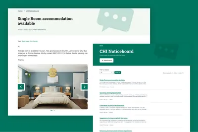
With their four hospital locations spread out across Ireland, the staff felt the need for a stronger sense of community and a way to feel more connected despite being a large hospital network. One site used an online noticeboard to share announcements, lodging availability, and internal events, which helped foster that connection. To build on this, we enhanced the intranet’s usability by maximising its features and giving them a way to comment on posts and engage within the intranet, making it easier for them to stay connected and feel like they are part of a unified team.
Theming the intranet
Since there was a possibility that hospital staff would need to switch from the public-facing site to the intranet throughout the day, the intranet required a distinct but cohesive look to avoid any confusion. So we gave it a unique colour theme that ran throughout the entire design, with a layout that’s been designed to solve specific user needs.

All of this to say…
The IA and interaction design enhancements we made to the new intranet should significantly improve the working lives of CHI staff. Throughout this project, our process has been strongly grounded in user research and the results are designs which are appealing, accessible and on-brand.
If you need help researching and designing for a unique user group, please get in touch.
Looking for support with anything we've outlined above?
More
-

Maximise the impact of your intranet: 8 things to consider
Ben Heasman Client Partner (Public Sector)
-

Approaching a National Data Library: lessons from GOV.UK Registers
Ellie Ashman Director of Public Sector Practice
-

Google's stance on AI-generated content: Considerations for the Public Sector
Emma Bennett Gigg Head of Digital Marketing
- See more posts