
Onwards! Accessibility auditing with WCAG 2.2 and beyond
At Torchbox, we are committed to creating maximum positive impact. One important aspect of this commitment is creating accessible and enjoyable web experiences for everyone. We are continuously working to improve our accessibility expertise and adopt a strategic approach to it.
So, when it comes to redesigning our own website, we want our aesthetic glow-up and also to make it as accessible and inclusive as possible. We started the new iteration with an accessibility audit of the existing website. We follow the Web Content Accessibility Guidelines (WCAG) - the most well established standard for web accessibility. Since this wasn’t our first accessibility audit for torchbox.com, this time we targeted the recently released WCAG 2.2 version (AA level), including highest AAA-level rules whenever applicable, as well as practices that go beyond the WCAG standard, such as Windows Contrast Themes compatibility.
Spoiler alert 🤫: Our recent audit showed mostly minor issues compared to the previous one, or issues that are AAA-level. The website's accessibility has greatly improved since then!
Testing methodology
To perform this accessibility review, we used a combination of automated and manual testing tools. This ensures that we cover a wide range of accessibility needs and pick up any issues that automated testing tools cannot.
Automated tools
- V.Nu HTML5 validator
- Pa11y – HTML CodeSniffer, Axe
- Accessibility Insights (Chrome)
- Lighthouse (Chrome)
- Sa11y (Chrome)
It’s worth noting that although some automated testing tools are often perceived as interchangeable, in our experience each of them works a bit differently and may catch issues overlooked by others.
If you’re just getting started, we recommend starting with Accessibility Insights because it combines a good range of fully automated and semi-automated checks.
Manual tests
- Keyboard navigation
- Zoom & magnification testing with Chrome full-page zoom, font-size zoom and macOS Zoom
- Screen reader testing with VoiceOver in macOS Chrome
- Mobile touch interaction testing with iOS Chrome
- Contrast themes (simulated in Chrome)
- Other manual testing (like colour contrast check for non-text UI elements and images)
It’s important to always do manual testing, as automated checks can only identify between 30 and 60% of possible issues. For people just getting started, we recommend keyboard navigation tests as the one way to find the most issues with the least specialist knowledge required.
Our findings
The audit showed mostly minor issues, or issues that are AAA-level. Here are the top 5 issues we spotted.
Missing alternative text
One of the charts on our company impact report was missing alt text:
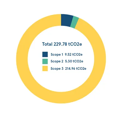
Adding appropriate alt text is very simple, and will make a big difference for readers. In this case, we chose to state what type of chart was in use, and directly write the text present in the image. We arrived at:
Doughnut chart: Total 229.78 tCO2e; Scope 1: 9.52 tCO2e; Scope 2: 5.30 tCO2e; Scope 3: 214.96 tCO2e
Inappropriate use of images
We’re glad our impact report isn’t an inaccessible PDF, but there was still room for improvement with overuse of images. This data should be an HTML table, rather than an image:
Using an HTML table would be the most appropriate so users can resize the text, copy as needed, or simply change the colors to match their browser customisations. Until this could be resolved with a new component, we chose to write more comprehensive alt text with the same data.
Mismatch between visible label and accessible name
The labels heard by screen reader users for our New Business Director's contacts differ from what is visually displayed. While we show a phone number (+441234567890) and an email ([email protected]), screen reader users only hear "Phone us" and "Email our New Business Director Will." The actual phone number and email address are not conveyed to them. 😅
Unclear ‘More’ button status for screen reader users
Screen reader doesn't announce if the 'More' button in the main navigation is selected, so it's unclear to the user if the button's submenu is already open or not.
Missing <!DOCTYPE html> declaration for one of the pages :)
Though it doesn’t seem to affect anything for modern browsers, this is clearly an oversight that needs to be addressed.
The full list of our findings can be found in our executive summary, and our audit spreadsheet.
What’s next
The audit results will be used as a foundation for the strategic approach to accessibility of torchbox.com, extending beyond mere bug fixes. This includes incorporating accessibility checks into the development and continuous integration processes, proactively identifying and addressing similar issues early on, and formulating necessary guidelines.
For future audits, we envision covering additional content and testing with more approaches:
- External systems which our site relies on, such as webinars on Zoom.
- All AAA-level guidelines
- Print stylesheets, which we learned a lot about as part of working with RNIB.
For those interested in delving deeper into accessibility or in need of assistance identifying potential enhancements for their project, we're here to support you. Our comprehensive accessibility testing services include both automated and manual tests, along with usability and cognitive accessibility audits.
More
-

Legacy Fundraising: How Charities Can Build Relationships with Donors
Michael Wilkinson Product Director
- See more posts

