Improve website usability with effective navigation labels

There are few rights and lots of wrongs when it comes to developing effective website navigation labels. Here are a few guidelines to help get you on the right path:
1. Focus on Top User Tasks
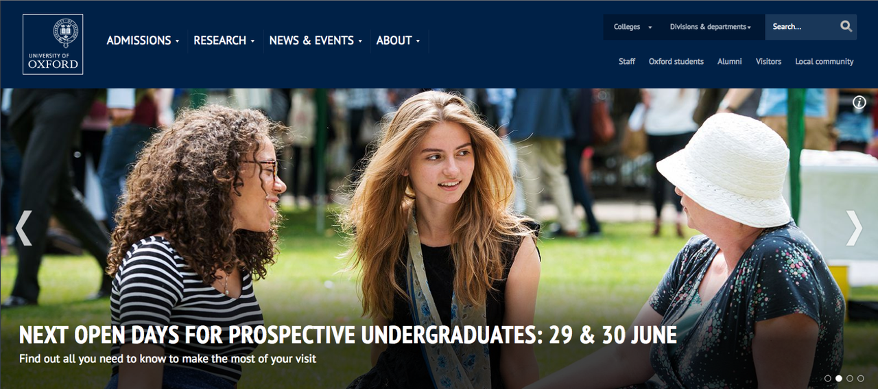
Your website's navigation should focus on the most important tasks that users undertake. As Gerry McGovern, creator of Top Tasks Management says, "top tasks are the small set of tasks (usually less that ten, often less than five) that matter most to your customers." The University of Oxford for example, features its most visited pages within its top navigation level. If you’re not 100% sure what your key user tasks are, delve into your website’s analytics and conduct user research to find out more.
2. Simplicity
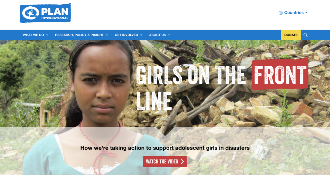
Navigation labels should be reduced to their shortest, clearest form and drop down menus simplified to the least number of options possible. For example, Plan International only has four top-level navigation labels to ensure users can easily access the information they’re looking for. We recommend having no more than five navigation labels (if possible), as it generally makes for easy scanning and clear information scent.
3. Consistent Labelling Style
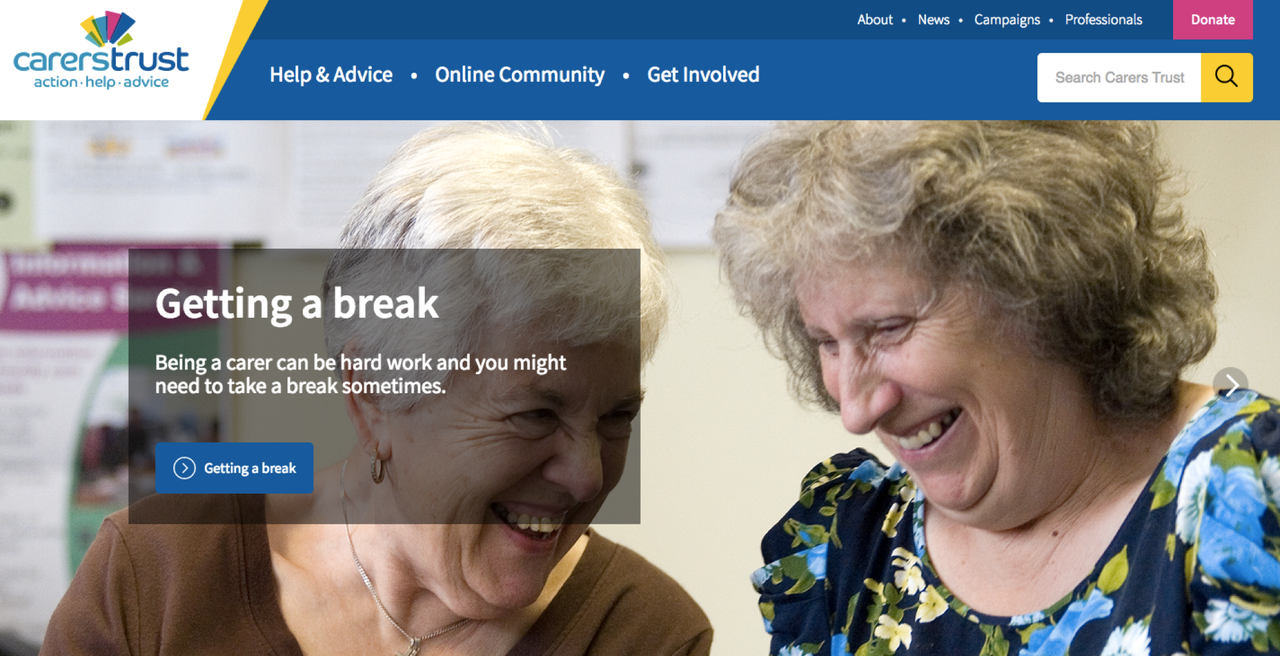
Try to keep navigation labels of a similar length and grammatical nature, e.g.: 'News & Blog, Research & Insights, What’s On & Events’ rather than 'News, What's On & Events, Research, Insights, Blog’. Try to avoid extraneous terms like 'our' too (i.e.: Our Team), or before you know it - they'll be everywhere. Carers Trust’s new website follows this approach. Its three main navigation labels are all of a similar length and word count.
4. Clear Labels With No Ambiguity
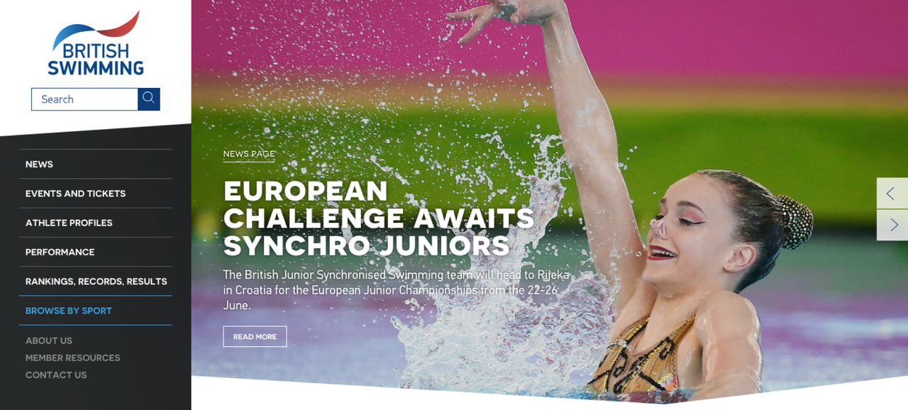
Labels like 'information' and 'resources' are ambiguous. Ensure your website’s labels provide as much information as possible. They don't need to map to key user tasks faithfully, but they do need to give visitors a good idea of the content they're about to click through to. British Swimming has got this approach right.
5. Order Matters
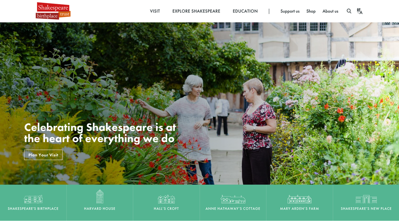
According to the Primacy vs Recency Effect, items at the beginning of a list are considered by users to be the most important. Keep this in mind when structuring your top navigation level. Put the tasks which are most important to users first. By doing this, you’ll ensure that users are able to access the information they want quickly, and easily, reducing your site’s overall bounce rate. For example, Shakespeare Birthplace Trust has listed ‘Visit’ first, as it understands that visitors are most interested in finding out about its attractions.
6. Give a Sense of Your Organisation
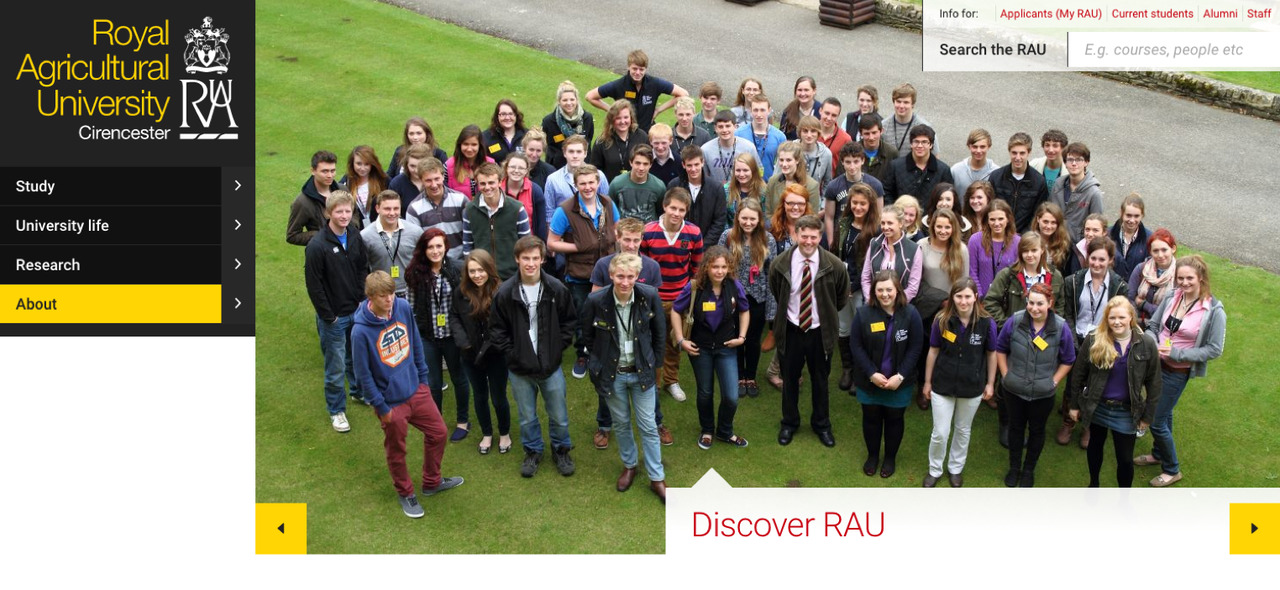
Last and by no means least, ensure that your navigation labels give a sense of what your organisation is about. It’s easy to use generic labels such as ‘What We Do’ and ‘Who We Are’, but these give visitors little insight into what your organisation actually does. Instead, focus on providing users with as much information as possible. The Royal Agricultural University’s website has achieved this. Its top navigation labels effectively communicate what the University is all about: study, culture and research.
Keen to learn more?
If you've got any questions about your website’s navigation labels or if you’d like to find out more, please get in touch and one of our experts will get back to you.