Design trends: all the best, big hero image

It’s a design trend that’s everywhere and like most of the industry, at Torchbox we often use large banner images in our designs. It's becoming as conventional as placing the logo in the top left corner. But come on, let’s stray from our comfort-zone and explore some creative and effective alternatives…
It’s about hierarchy, impact and aesthetic
Why do people love hero images? Let’s face it, they are pleasing on the eye (or maybe we’re just used to them). A big striking hero area at the top of a page, grabs people's attention and gives them an initial point of focus - a place to start. It’s a tried and tested way to engage people with a site's core offering.
You could also argue that wide landscape photography lends well to the dimensions of the viewport... but does it? Well actually maybe not, since browser window dimensions are now so varied, we often see hero images designed for desktop computers getting badly cropped on a phone.
The standard aspect ratio on cameras is not mega-widescreen by default, and a challenge our clients often face is sourcing rich, quality photography that can work effectively in this kind of space. So we can’t always rely on great photography and often need to find smarter ways to achieve the same kind of impact.
It’s great when you’ve got the pics
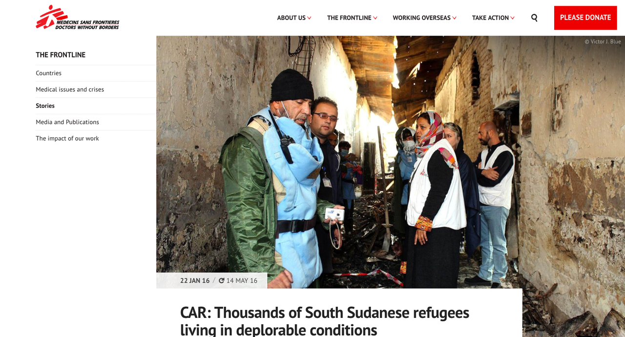
We recently redesigned the website for Médecins Sans Frontières UK (MSF). It was a designer’s dream to work on this project as there was a plethora of great photography from the field (not to mention working with such a cool organisation). And with such an extensive back catalogue of photos, we were able to use large emotive imagery on key country and medical issue landing pages for impact.

But for news articles (that often need to be published quickly in response to crises), we wanted to make it easy for MSF's editors. So we designed these pages to accommodate more conventional 6:4 photos, so that editors didn't need to get their Photoshop chops out and make tricky cropping decisions. Thanks to this feature, MSF's library of photos can quickly be added to the site, with little fuss.
But every organisation is different and doesn’t always have the resource for building up such a wide range of imagery. We don’t want to design our clients into a corner, expecting them to come up with knock-out banner images for every page...
So toodle pip, big hero image, all the best and love to the kids - we’re going to explore a few new and interesting ways to guide users through content, but still achieve the impact you get from a stunning photo.
Experimental layouts such as split-screen
Split-screen layout has been gaining traction recently and has been tipped as a trend for 2016-2017. I like it - it works really well when there are two distinct paths people can take. It also means it’s easier to use more conventional photography without needing the awkward crops I mentioned before. However, on larger information sites we need to be mindful of how this layout can relate to the wider site navigation. It can also cause hierarchy issues if used purely for signposting, but as a layout technique it might just make life easier for editors sourcing that killer image.

Space & Type
We shouldn’t underestimate the power of white-space. It’s great how the smart use of negative space can help to focus people on specific elements. In truth, this trend has been around a while, but a bold typographic style set with decent breathing space is often very effective.
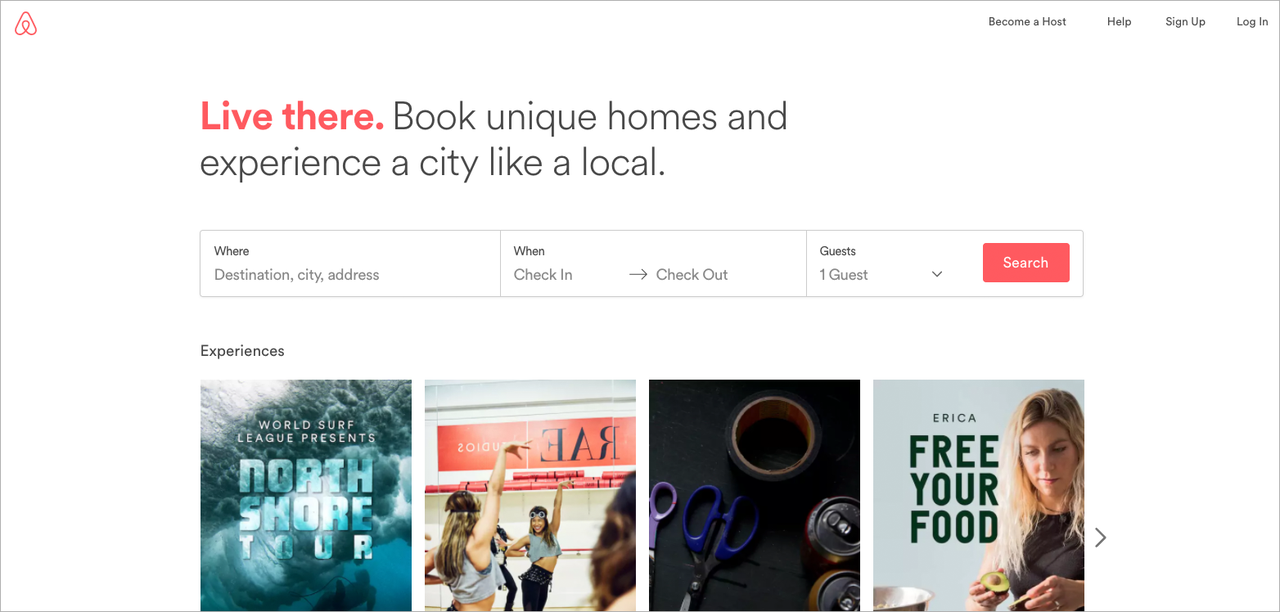
Airbnb recently updated their homepage. They’d previously been playing with large video backgrounds that worked well when the video movement was subtle... but recently it had become a bit too in-your-face. So I was pleasantly surprised to see their latest update; a restful, clean top area of white space with just a simple slice of typography describing what Airbnb is all about. This then leads into the main focus of the site - searching for places to stay. It feels understated, thoughtful and very effective at setting new users’ expectations for the site’s purpose.
We are lucky that web typography has become so advanced and flexible. We are now able to do so much more with type, including creating impact and engaging aesthetic, in the absence of good imagery.
Overlaps, vibrant colours & SVGs
Overlapping elements is a cool way to encourage scrolling and achieve a sense of page flow. It helps to create relationships between content, and can help guide users to the correct narrative.
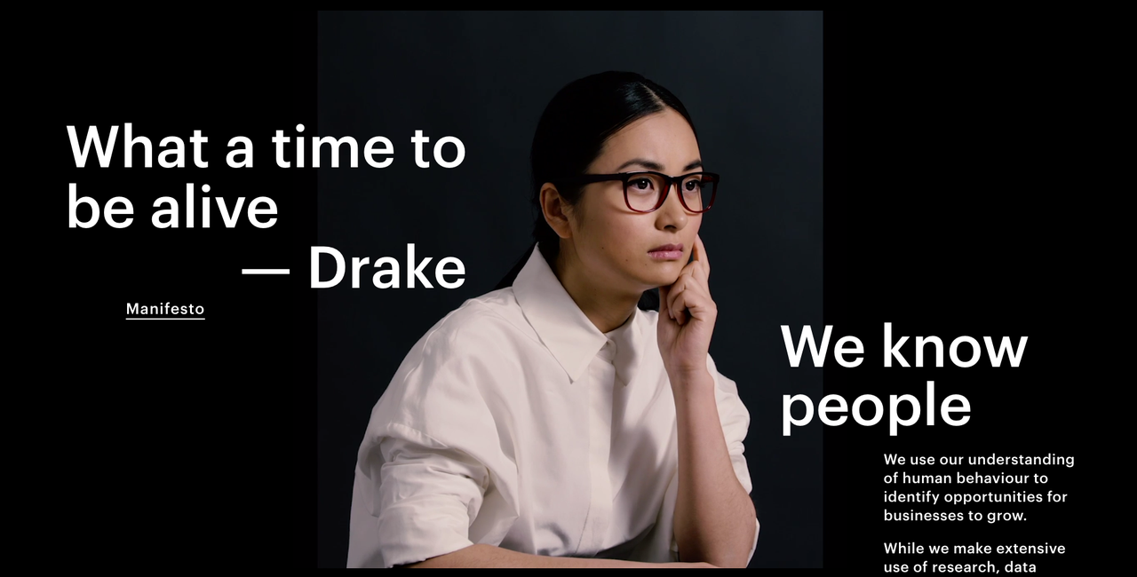
The now less popular trend of parallax scrolling (where images and text appear and move at different speeds as you scroll) exaggerated this effect to quite annoying proportions, where basic usability gets undermined by distracting animations. But we are now seeing a more sophisticated approach to scroll-based animation and transitions. Overlapping semi-transparent SVGs, used in combination with vibrant colours and disruptive typography… I can see this replacing the ol’ hero image, for brands and organisations that are less photography-led.

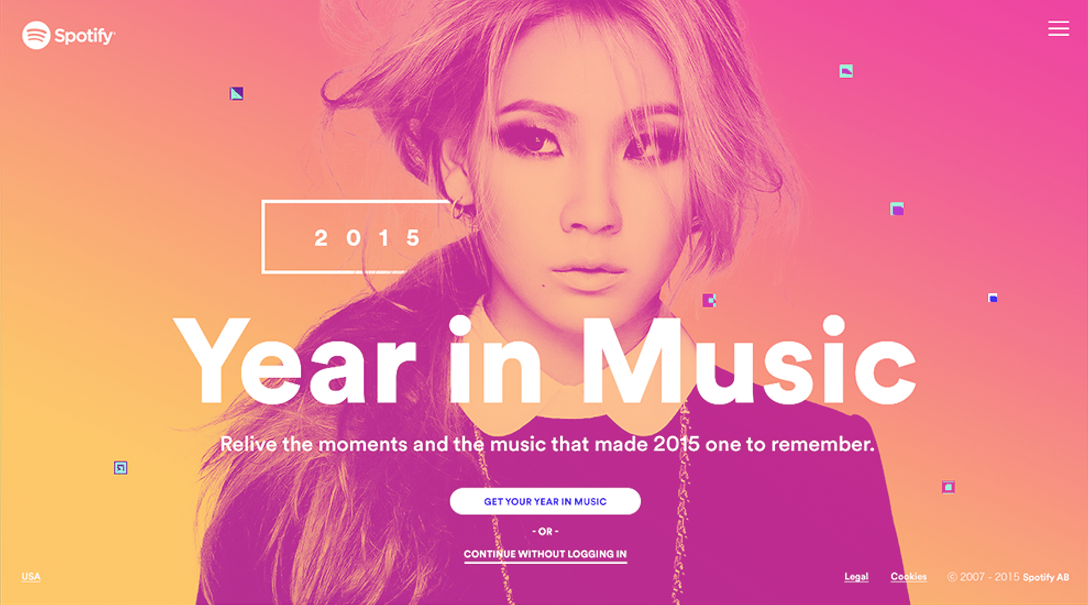
Spotify has been adventurous with colour this year with their range of duotones and bold gradients, and the V&A's new site has a lovely palette that offsets dark backgrounds and playful typographic treatments of its brand. More generally, we are seeing people use more vivid colour schemes. This is partly down to the larger amount of retina screens that are better at handling brighter shades in combination with crisp type, whilst maintaining legibility. I think marketeers and designers will continue to be more experimental with colour and type in 2017, creating an engaging design language.

Variety is the spice of life
Big photos are great, but there are other ways to get someone’s attention. Take some time to think about the web design tools and technologies available, and about who is going to be updating the content (and the resources at their disposal), and most importantly, think about what kind of interface will help your users achieve their goals. And who knows...there may just be a more effective and original design solution than a widescreen hero banner image for that knock-out landing page.