Children’s Health Ireland
Turning five hospital websites into one for Children’s Health Ireland

Turning CHI’s fragmented web presence into a single website that, in their own words, was ‘driven & influenced by the needs and behaviours of users’ was no easy task. So we started from the ground up with an intensive content audit, spending time understanding the needs of parents, carers, young people & healthcare professionals, creating a brand new style guide and strategy, and a complete rewrite of all remaining content. The result is a website that not only showcases CHI as a united organisation with a shared vision, but has over 80% fewer pages and provides much needed clarity for its users too.
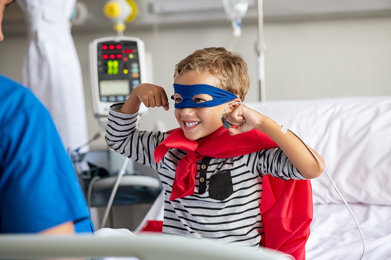
With a new state-of-the-art children’s hospital set to open soon in Dublin, Children’s Health Ireland (CHI) were keen to refresh their online presence in order to bring much-needed clarity for patients using CHI services. They are the single provider of health services for children and young people across Ireland and currently operate four children’s hospitals. The new hospital aims to bring a number of CHI’s core services under one roof and show a united organisation, so the website needed to reflect this by bringing each of the existing sites together with one clear voice and message. Our shared vision for the website helped to drive this forward: we wanted to transform children's health experiences across Ireland by bringing life-saving clarity to children and those who care for them.
Creating one cohesive website
Replatforming was just the beginning for this project. The real challenge was untangling five websites packed full of outdated, inconsistent and wide-ranging content (including ward and service information, clinical guidelines, patient information, visitor information) and merging them into one unified, all-encompassing website.
Thankfully, CHI were aware that they had a big problem with content rot and that their existing websites were bloated and lacked governance. This made the sites difficult to navigate for patients, their families and even CHI staff. When paired with poorly written content, this lack of clarity caused all kinds of issues, from missed appointments to confusion around medical guidance. We all agreed that a full content audit would be needed as our first step to tackling this problem, and that we’d have to be brutal.
Anything that wasn’t meeting user needs or in line with our vision was flagged for removal or revision. In the end, we were able to remove 81% of the content that existed. Where the previous sites contained a combined total of 1,253 pages, the new website has just 231.
Developing a clear style and strategy
Each hospital website team also had its own way of writing content. Some came across as very corporate and technical, while others were written in plain English with a friendlier vibe. This meant that none of the content, even the good bits, could be imported as-is. Particularly in a clinical context, where people can be trying to access information whilst experiencing high levels of angst, consistency & clarity of content is paramount. Equally, from our previous work with the NHS, we were also mindful of the fact that health services’ content needs to meet people’s clinical, practical and emotional needs. With that in mind, we felt strongly that all of CHI’s content needed to be rewritten with parents, carers & children in mind.
With no existing style guide to take forward, we started from scratch by running a series of workshops with key stakeholders to define CHI’s unique tone of voice. This formed the basis for a full style guide, giving content creators a consistent written style and format to follow.
We also provided a content strategy detailing the types of content CHI should be creating, and when they should be linking to other sites instead.
Since there were a lot of layers to CHI’s website, we dedicated considerable time to designing the navigation system. Our goal was to ensure easy access to specific content within each page and place a strong emphasis on usability, with the aim of enabling site visitors to locate essential information from whatever device they are using. This could include information about the staff in charge, the hospital nearest to them, as well as insights into the range of services that CHI provides.
Jeth Ordeniza, UX/UI Designer at Torchbox
Collaborative content creation
CHI were keen to be involved in the content creation process right from the start. Working collaboratively on this allowed the team to learn by doing, so that by the time the project ended they were confident in their abilities to continue creating great, user-focused content.
To do this, we chose a selection of pages from each key page type to rewrite as best practice examples for the team at CHI to follow. Once everyone was happy with them, CHI was then able to use these examples to help them create the remaining content. The first batch of this content was reviewed by us and CHI were given feedback and amends to help them refine it. We also spent some one-on-one time with key members of the team to provide answers to questions, talk through amends and work through pages together.
A new website that works better for users
The previous websites were a hard-to-navigate maze of information that meant it was easy for patients, their carers and busy health care practitioners to miss crucial details, or left them struggling to find answers to their questions. By going back to basics we were able to focus on what its users needed most, and that was clarity.
To help us ensure we achieved clarity for all users, one of our key objectives was to provide a highly accessible and responsive experience. The new site has reduced accessibility issues by 40% and increased site performance by 28%. We also saw a 40% increase in users visiting the site in the three months after launch, with 30% of users returning, indicating a much greater reliance on the site. The third most popular page is now the consultants listing, a new page that was created because of a content gap identified through user research.
This project was a very significant milestone for CHI as it prepares to open a new children's hospital and implement a new model of care. Moving from 5 websites and several thousand web pages to one single website made this a complex challenge. It was equal parts content project, web design project, technology project, and a major change management initiative. In short, it was a critical transformation to establish the online presence for CHI and improve access to information for patients and their families. Working with the team at Torchbox helped us deliver across all these areas, and to deliver a dramatically improved digital experience for all our users.
Martin Clancy, Digital Manager/Project Lead at CHI
The team at CHI were first alerted to Wagtail CMS off the back of it being used widely across the health space - including for NHS.UK. Because of the experience Wagtail offers, things have improved for content creators and editors behind the scenes too. Now, the team only needs to keep one site up to date, and they’ve reduced their CMS instances from three to one. The content workflow we created together now means that individual teams at CHI are able to create their own content with centralised oversight from the communications team - meaning that expert teams are providing expert content for users. A report for stale content means any content requiring review will be visible to editors, reducing the risk of redundant or irrelevant content being available to the people who are relying on it. Along with the style guide and strategy the team now has all the tools they need to maintain the site’s high standards and continue creating great content.
We’re excited about the prospect of continuing to work with CHI in the years to come and helping to consolidate their digital estate further with Wagtail whilst harnessing the power of good content strategy to create life-saving clarity.